

Your website often represents the key moment in a potential client’s decision to trust you before they even read your offer or pick up the phone. In an era where users make decisions in seconds, a professional and user-friendly design makes all the difference. On the other hand, a poor experience from slow loading times to confusing navigation can drive visitors away and slow down your business growth.
In this article, we’ll go over the 6 most common mistakes that sabotage website growth and explain how to identify and fix them so your online presence can be effective, clear, and successful.
1. Slow Loading Speed ( Bad Perfomance )
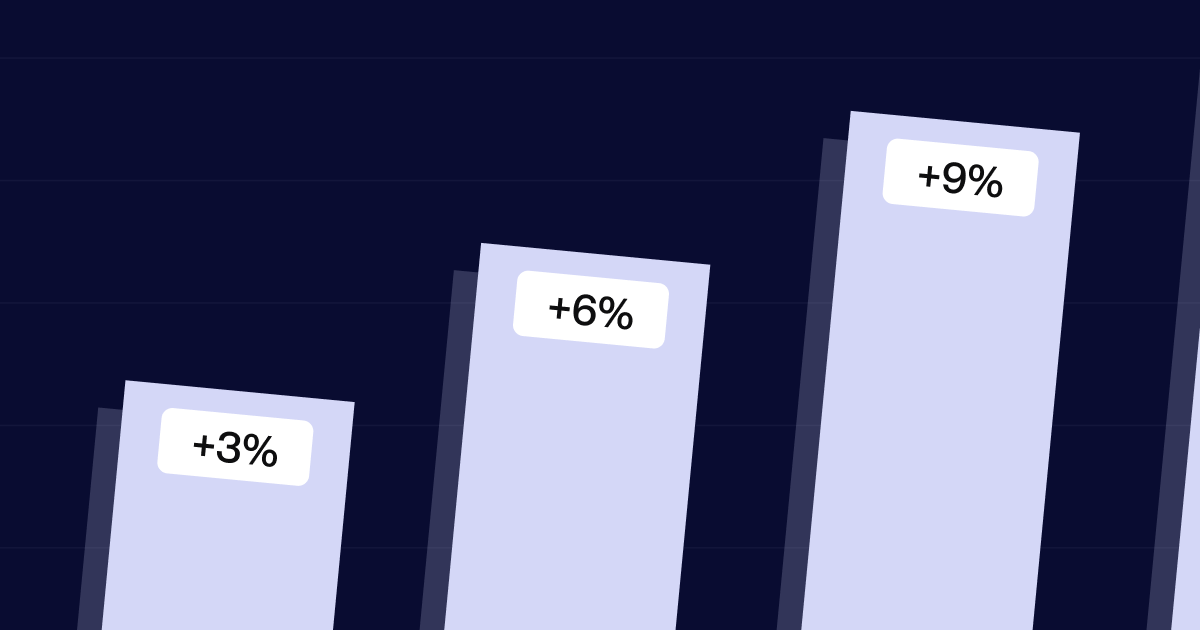
In a time when users expect instant access to information, even a 2–3 second delay can be enough for a visitor to leave your site and never return. Page speed isn’t just a technical detail it has a direct impact on your website’s overall effectiveness, from traffic to conversion.
User Experience
Users today have very little patience. If a page doesn’t load quickly, they move on to the next Google result often a competitor. Slow websites frustrate visitors, reduce their engagement, and seriously damage the first impression of your brand.
SEO ranking and visibility on search engines
Since 2010, Google has confirmed that site speed is a ranking factor. Slow websites not only lose users but also lose positions in search results. This directly means less organic traffic, fewer sales opportunities, and reduced overall online brand visibility.
Unoptimzied Images
Using photos directly from your phone or stock sites without compression.
Solution: Use tools like TinyPNG or compress images directly to reduce file size without losing quality.
Too many external scripts and unoptimized font
Loading unnecessary JS libraries, external fonts, and marketing scripts slows down the website.
Solution: Analyze which scripts are truly necessary, use lazy loading, and convert fonts to the WOFF2 format.
Bonus tip: Check your site speed
Before you start optimizing, check your website’s current state so you know where you’re losing the most performance.
Visit Google Speed Insights and enter your page URL:
You’ll get a detailed report on speed, performance, and recommendations especially for mobile devices, where most users visit websites today.
Note your current score now, then compare it after optimization. You’ll be surprised how much improvement is possible.
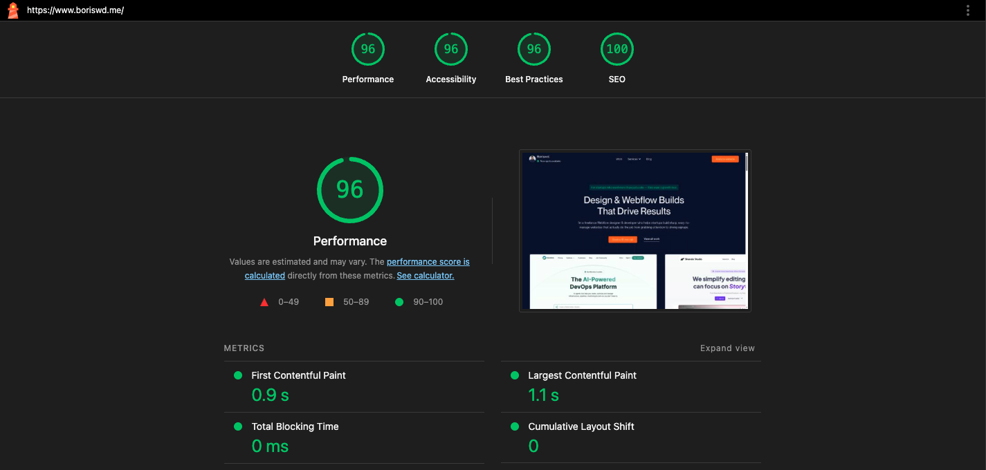
This is what a successfully optimized website should look like.
Take advantage of a free audit of your website! Together, we’ll identify the bottlenecks slowing your growth and create concrete solutions that deliver results.
2. Poor mobile experience
More than 70% of users today access the internet via mobile devices, which means your website must work perfectly on phones and tablets not just on desktops.
Text and buttons are too small
Text often becomes unreadable due to being too small, while buttons can become too small or too close to other elements, making them unclickable and hindering interaction. This creates a poor user experience and can lead to visitors leaving the site.
Solution: Use relative units (EM, REM) for sizing and check color contrast for better readability. Also, make sure buttons are large enough and have enough spacing around them to be easily clickable on touchscreens.
Inappropriate Navigation
A standard menu that works well on desktop often isn’t adapted for smaller screens, causing users to have trouble finding or using the navigation.
Solution: Implement a hamburger menu or dropdown menus that are easily accessible and simple to use on mobile devices, making navigation easier and increasing user engagement.
Too much content and overlapping elements
When you place too much content or complex elements on small screens, they can start to overlap or look crowded, making it difficult for users to clearly see and use all the site’s features.
Solution: Reduce visible content on mobile devices by hiding less important sections or placing them inside accordions or tabs.
3. Unclear Navigation
If users can’t easily find what they’re looking for, there’s a high chance they’ll leave the site. Navigation should be clear, logical, and consistent across all devices.
Too many unclear links in the menu
When the menu is overcrowded with links, users feel confused and don’t know where to start. Also, links like “Solutions,” “Pages,” or “Information” don’t clearly indicate what the user can expect when clicking them.
Solution: Ideally, have 5–7 main menu items. Use clear, specific labels instead of vague ones replace “Solutions” with “Our Services,” and so on.
Lack of hierarchy and structure
Lack of submenus, grouping, or logical arrangement of items makes navigation difficult.
Solution: Use dropdown menus, spacing, and grouping so visitors can more easily scan the menu and understand the site’s structure.
Bonus tip: Test user behavior
Use tools like Hotjar to track how users navigate your site and identify where they most often get lost in the navigation.
4. Outdated design
A website that looks visually outdated can immediately leave a bad first impression, making it seem like your company no longer exists, isn’t serious, or doesn’t invest. Even if the information is accurate, poor design automatically undermines credibility.
Too many colors and fonts
Using too many different colors and fonts can confuse visitors and distract them from what really matters your message, products, or call to action.
Solution: Use a defined palette of 2–3 main colors that fit your branding and 1–2 fonts.
Inconsistent element layout
Older websites often use fixed widths, tables, and inadequate spacing, which makes reading and navigation difficult.
Solution: Use a modern grid layout with clear information hierarchy and plenty of white space.
5. Outdated Technologies
Using outdated tools and platforms to build your website not only makes maintenance harder but also directly affects user experience, SEO, and site security.
Difficult maintenance and updating
Even the smallest changes can require hiring a developer. Depending on their availability, these updates can take days or even weeks.
Solution: With modern tools like Webflow, Framer, or Wix, you can make most changes yourself without any coding knowledge.
Harming your SEO
AI models like LLMs are becoming key factors in SEO strategy. However, on older systems, it’s often difficult to implement modern SEO practices such as Schema Markup, which helps your content be clearly understood by both search engines and AI models.
Solution: Using new technologies and implementing advanced features is becoming simple and accessible without technical knowledge.
This means your site can effectively communicate with Google and AI tools, leading to greater visibility and relevance in the long run.
More on this topic how to optimize your site for AI search engines in my recent blogs:
Improve visibility on Webflow site with Schema Markup
LLM.txt and Webflow: Step-by-step guide to better AI site optimization
6. Unclear CTA
Without a clear call to action, visitors don’t know what to do next whether to contact you, browse products, or sign up for the newsletter. This creates confusion and drastically reduces conversion chances.
“Click here” doesn’t tell the user what they’ll get or why they should do it — bad example.
“Book a guide for better SEO” is clear, specific, and focused on user value — a good example.
How to improve it:
- Be specific — clearly state what the user will get and what they need to do.
- Highlight the value — emphasize the benefit, like “Speed up your site” instead of just “Read More.”
- Place it in the right spot — the CTA should be visible and logically positioned after useful information.
Your website is often the first (and maybe the only) chance to make an impression on a potential client. Poor performance, confusing navigation, outdated design, or unclear calls to action are all factors that can slow down your business growth before you even notice.
The good news is that most of these problems can be easily solved with timely updates, modern tools, and a strategic approach to design and content.
Have a brief? Let’s chat
Let's chat about your project, your needs, our expertise, our portfolio, and how we can join forces to create something cool!